
In May 2022, I joined Lisk as their Product Designer, collaborating
with a talented team of engineers, researchers, product owners and
tech lead.
Lisk is designed for high-growth markets, empowering founders
and builders worldwide to thrive on Ethereum for the first time. To
amplify its value and better serve its community, Lisk needed a
dedicated platform beyond its main website.
This vision gave birth to the Lisk Portal—a hub offering diverse
features like Staking, Bridging Tokens, Migrating Tokens, Airdrops,
and seamless access to its expanding ecosystem. To support the
Portal's rapid growth and evolving needs, the Lisk Portal Design
System was born—a centralized foundation that ensures a cohesive and
scalable user experience.
Now there was a blueprint for success, providing a unified
design language and structured framework. It empowered our team to
design and build faster, reducing the need to reinvent elements while
maintaining the Portal’s polished, consistent look and feel.
Position
Product Designer
Company
Project
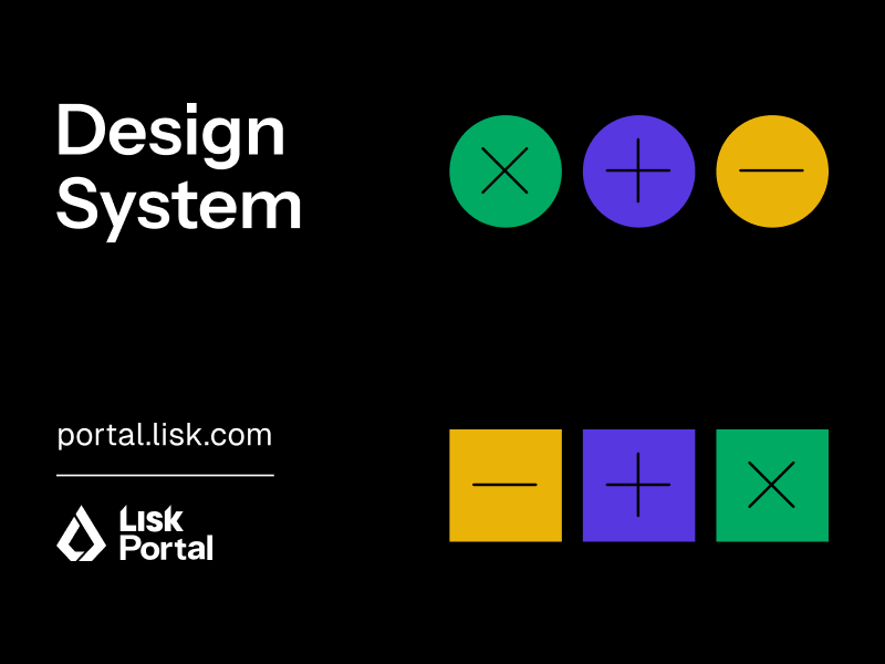
Lisk Portal Design System
Timeline
September, 2023 - Still growing
Tools Used
Figma, Notion, HTML/CSS, and extensive research
 Visit Lisk Portal
SUMMARY
The development of the Lisk Portal began in Q4 of 2023. As the sole
Product Designer, I collaborated closely with the tech lead, product
manager, and software developers to create a centralized hub for the
Web3 community.
With the Lisk brandbook already in hand, I was able to efficiently craft
a comprehensive design system that promotes consistency, streamlines
workflows, and enhances collaboration across teams and departments.
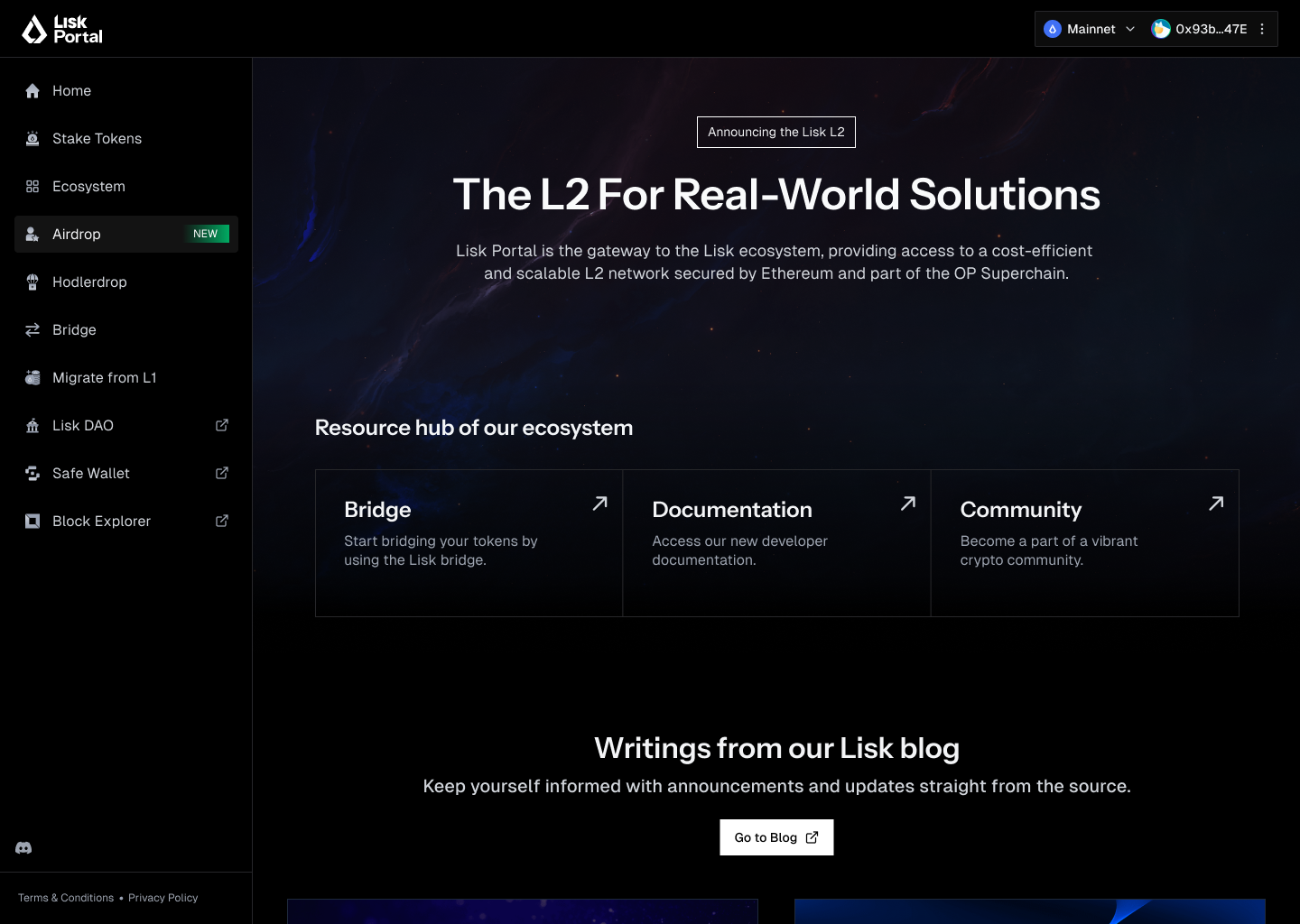
Live version of the Lisk Portal, 12/05/2024
Details
As the sole Product Designer, balancing the development of the Design
System with fast-paced UX work required strategic prioritization. The
system needed to scale quickly to accommodate new use cases while
constantly being refined and expanded. In collaboration with the tech
lead and front-end engineers, we aligned on key priorities.
Since the developers preferred preexisting component libraries and icon
sets, we adopted
Shadcn components
and
Lucide icons
(16px and 20px) as the foundation for building components and managing
iconography. Establishing a stable environment upfront was essential for
seamless design and implementation. This approach emphasized reusable
components and templated layouts, ensuring rapid scalability and
modularity throughout the process.
With the Lisk brandbook already in hand, I was able to efficiently craft
a comprehensive design system that promotes consistency, streamlines
workflows, and enhances collaboration across teams and departments.
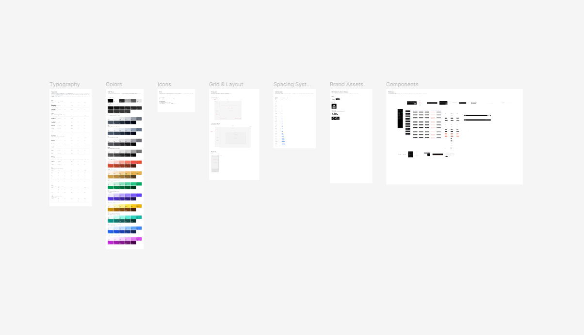
High level look of the Design System
Through extensive research conducted with the product manager, we
ensured that user insights were deeply embedded into the design system.
Our focus included analyzing the Web3 ecosystem and how various
platforms approached their designs. Where possible, I incorporated real
data values into the system to make it both practical and grounded.
After a rigorous research phase, I distilled key principles for Web3
design:
The first step was to define the structure and layout of the Portal
before focusing on the foundational elements such as typography, color
palette etc. After presenting several options to the leadership team, we
collectively decided on a double-navigation layout.
This design includes:
This approach ensures that users have all essential information presented clearly and concisely. Our goal was to provide simple, intuitive instructions, enabling users to get set up and running quickly.

Guidelines for normal Desktop resolutions (1440x1024)

Guidelines for widescreen Desktop resolutions (1920x1080)

Guidelines for Mobile resolutions
Once the layout and its constraints were finalized, it was time to focus on designing the foundations—color, typography, icons, spacing systems, components, and more. This stage laid the groundwork for a cohesive and scalable design system.
Color plays a vital role in distinguishing our brand and ensuring
consistent experiences across all products.
For the rebrand, Lisk embraced a classic black-and-white duo as the
primary colors, perfectly aligning with its dark mode-first
approach—consistent with the brandbook and marketing website.
Many components were infused with primary brand colors, creating a
cohesive visual identity that propagated seamlessly across the entire
Lisk Portal. Beyond this, we defined a comprehensive color palette,
including neutral tones, layer colors, success, error, warning, danger
states, and even custom gradient styles. These essentials formed the
foundation of a rich yet straightforward color system.
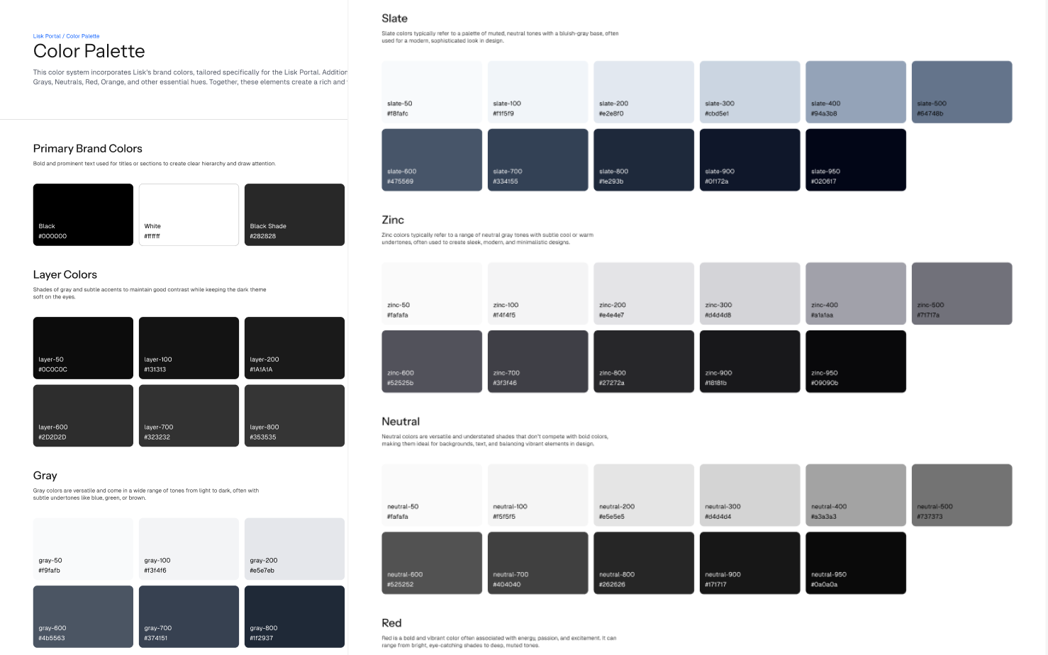
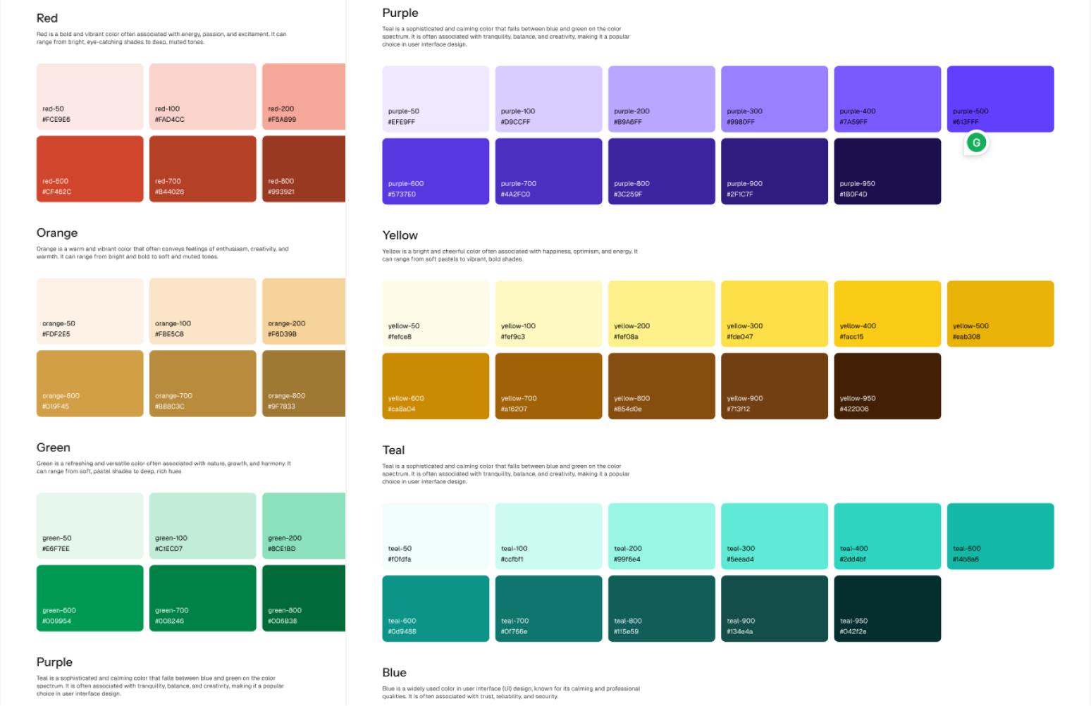
Plus other useful colors :)
According to the brandbook, Instrument Sans was designated as the
primary font family for headlines and display text. This modern
sans-serif font is aesthetically pleasing, well-balanced, and highly
readable.
For body text, I introduced Geist—and it was a game-changer. Instrument
Sans and Geist work harmoniously together, both being sans-serif fonts
that perfectly complement each other.
This pairing greatly enhances readability and user engagement by
applying distinct fonts, weights, and styles to various functional areas
of the UI. The diverse weights and proportions ensure design harmony
while offering suitable options for headlines, subheadings, and body
text, creating a seamless and polished visual experience.


Our spacing system is based on core units of 4px and 8px, which form the
foundation of a scalable and consistent layout framework across all
products.
Using these base units, we developed a spacing scale—a predefined set of
values that ensure UI elements are laid out with visual harmony. Each
value is a multiple of the base units, ranging from 0px to 80px and
beyond, providing the flexibility needed for diverse layouts while
maintaining consistency.
A well-defined spacing system not only creates a more harmonious user
experience but also serves as a foundation for responsive design and
customizable UI density in the future, enhancing both the quality and
accessibility of our products.
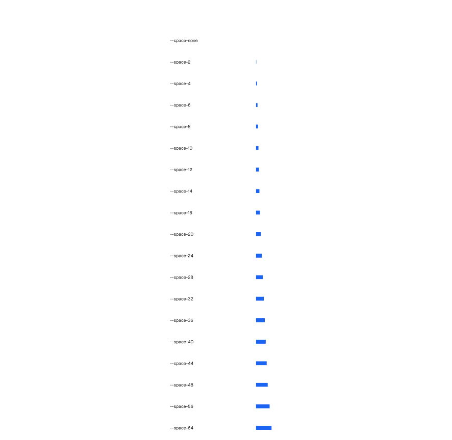
While it’s unlikely we’ll ever need more than 112px of spacing, it’s always better to have clear guidelines in place—even for those rare, unconventional use cases.
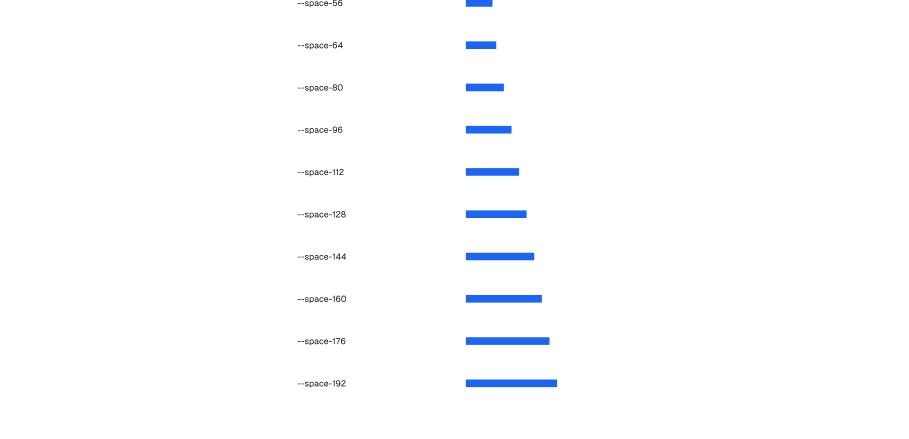
Given the time constraints of product development, creating custom icons
wasn’t feasible. Fortunately, the abundance of high-quality icon
libraries available today, such as Material Icons, Heroicons, Feather
Icons, and Remix Icons and many other, made it easy to adapt an existing
library to our product.
For our needs, we chose
Lucide Icons, and here’s why:
What mattered most to me was the ability to customize the stroke width. This flexibility allowed me to test and fine-tune the stroke width to perfectly suit our specific use case, ensuring a polished and cohesive look throughout the design.
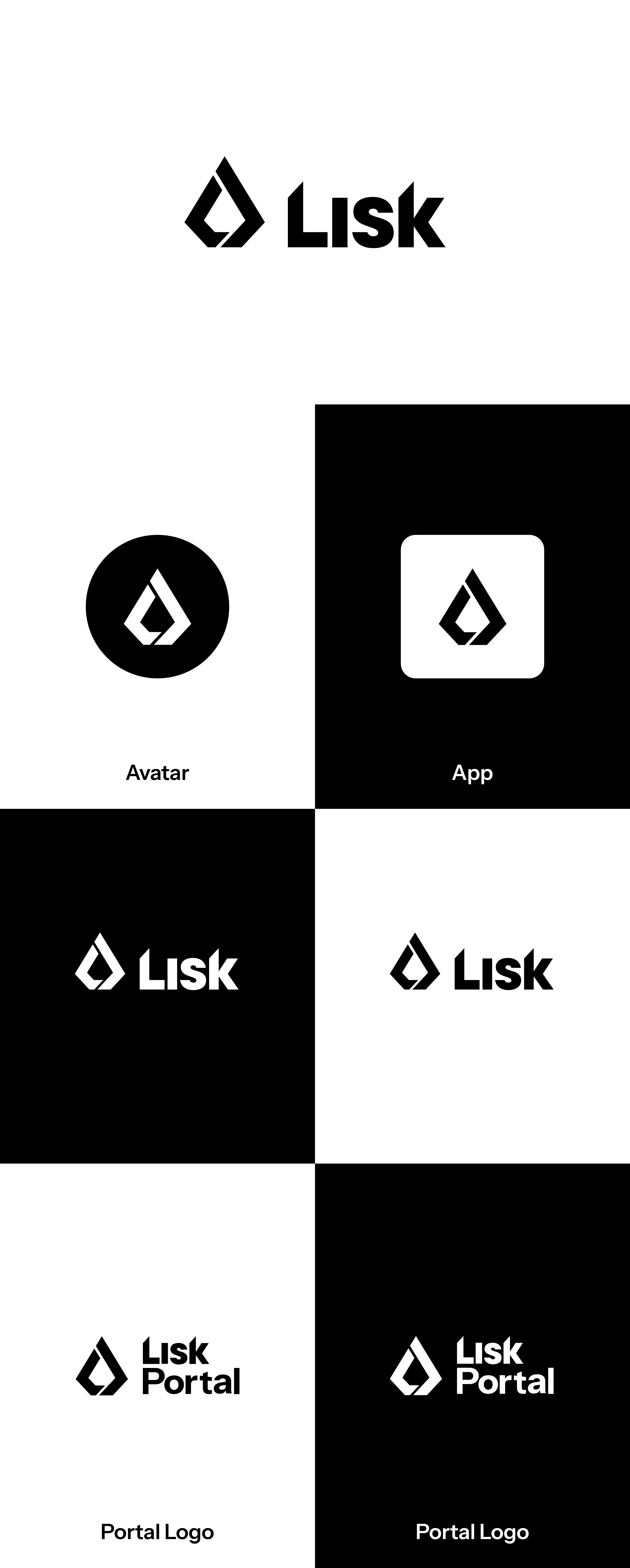
The Lisk logo serves as the primary logomark, prominently featured in
the Lisk Portal logo as its symbolic representation. To emphasize the
platform’s role as a hub for Lisk within the crypto space, the word
"Portal" is incorporated into the logo, reinforcing the idea of a
dynamic, central platform for the cryptocurrency ecosystem.
This combination creates a cohesive visual identity that aligns with
Lisk’s mission and its Web3 presence.
Lisk is a Web3 platform empowering developers with near-zero transaction
fees and seamless interoperability.
Built on Ethereum’s Superchain, Lisk enables builders to scale apps
while connecting to a global network.
With security from Ethereum and support through human-centered
accelerators, Lisk provides the
tools and mentorship needed to
succeed in the rapidly evolving Web3 space.
Components are the reusable building blocks of our design system, each
crafted to address a specific interaction or UI need. They are carefully
curated to work harmoniously, creating visual and cognitive patterns
that foster intuitive user experiences.
While Shadcn serves as the base format for some components, custom
components have also been developed to meet unique UX requirements and
provide tailored solutions for the Lisk Portal.

Communication played a key role in developing the design system for several reasons:
The Design System was pivotal to the successful launch of the Lisk Portal:
I'm available to build something great—let’s connect!
Email me today, or call
+389 76 608 752, or reach out on
Instagram
or
Linkedin.